Machine learning with tidymodels: Binary Classification Model

A gentle introduction
In this post, we’ll learn how to create Machine learning models using R. Machine learning is the foundation for predictive modeling and artificial intelligence. We’ll learn the core principles of machine learning and how to use common tools and frameworks to train, evaluate, and use machine learning models. in this post we are going to manipulate and visualize diabetes dataset and train and evaluate binary regression models. But before we proceed, we need some packages to accomplish the step in this post. We can have them installed as:
Then we load the packages in the session
Binary classification
Let’s start by looking at an example of binary classification, where the model must predict a label that belongs to one of two classes. In this exercise, we’ll train a binary classifier to predict whether or not a patient should be tested for diabetes based on some medical data.
Explore the data
Let’s first import a file of patients data direct from the internet with read_csv function of readr package (Wickham, Hester, & Francois, 2017), part of the tidyverse ecosystem (Wickham & Wickham, 2017);
We then print the dataset to explore the variables and records contained in the dataset;
# A tibble: 15,000 x 10
   PatientID Pregn~1 Plasm~2 Diast~3 Trice~4 Serum~5   BMI Diabe~6   Age Diabe~7
       <dbl>   <dbl>   <dbl>   <dbl>   <dbl>   <dbl> <dbl>   <dbl> <dbl>   <dbl>
 1   1354778       0     171      80      34      23  43.5  1.21      21       0
 2   1147438       8      92      93      47      36  21.2  0.158     23       0
 3   1640031       7     115      47      52      35  41.5  0.0790    23       0
 4   1883350       9     103      78      25     304  29.6  1.28      43       1
 5   1424119       1      85      59      27      35  42.6  0.550     22       0
 6   1619297       0      82      92       9     253  19.7  0.103     26       0
 7   1660149       0     133      47      19     227  21.9  0.174     21       0
 8   1458769       0      67      87      43      36  18.3  0.236     26       0
 9   1201647       8      80      95      33      24  26.6  0.444     53       1
10   1403912       1      72      31      40      42  36.9  0.104     26       0
# ... with 14,990 more rows, and abbreviated variable names 1: Pregnancies,
#   2: PlasmaGlucose, 3: DiastolicBloodPressure, 4: TricepsThickness,
#   5: SerumInsulin, 6: DiabetesPedigree, 7: Diabetic
Though the printed output tell us that there are fifteen thousand records and ten variable, but sometimes you may wish to explore the internal structure of the dataset. The glimpse function from dplyr package can do that by listing the available variables and their types;
Rows: 15,000
Columns: 10
$ PatientID              <dbl> 1354778, 1147438, 1640031, 1883350, 1424119, 16~
$ Pregnancies            <dbl> 0, 8, 7, 9, 1, 0, 0, 0, 8, 1, 1, 3, 5, 7, 0, 3,~
$ PlasmaGlucose          <dbl> 171, 92, 115, 103, 85, 82, 133, 67, 80, 72, 88,~
$ DiastolicBloodPressure <dbl> 80, 93, 47, 78, 59, 92, 47, 87, 95, 31, 86, 96,~
$ TricepsThickness       <dbl> 34, 47, 52, 25, 27, 9, 19, 43, 33, 40, 11, 31, ~
$ SerumInsulin           <dbl> 23, 36, 35, 304, 35, 253, 227, 36, 24, 42, 58, ~
$ BMI                    <dbl> 43.50973, 21.24058, 41.51152, 29.58219, 42.6045~
$ DiabetesPedigree       <dbl> 1.21319135, 0.15836498, 0.07901857, 1.28286985,~
$ Age                    <dbl> 21, 23, 23, 43, 22, 26, 21, 26, 53, 26, 22, 23,~
$ Diabetic               <dbl> 0, 0, 0, 1, 0, 0, 0, 0, 1, 0, 0, 0, 1, 0, 0, 1,~
This data consists of 15,000 patients with 10 variables that were used to diagnose diabetes. In this post we tread a Diabetic as outome and the remaining variables as predictor. A predictor variable is used to predict the occurrence and/or level of another variable, called the outcome variable. Let’s tidy and reorganize in format that easy for model to understand. The variable names do not follow the recommended standard therefore we clean them using clean_names function from janitor package (Firke, 2020). We also notice that some of the variable like PatientId adds no effect in the model and was dropped from the dataset.
Further, since we are going to use classification algorithm in this we need to convert our our predictor variable–diabetic–from numerical to factor. This is the outcome (label) and other variable like Pregnancies, PlasmaGlucose, DiastolicBloodPressure, BMI and so on are the predictor (features) we will use to predict the Diabetic label.
diabetes.tidy = diabetes %>%
  janitor::clean_names() %>%
  select(-patient_id) %>%
  mutate(diabetic = if_else(diabetic == 1, "Diabetic", "Non diabetic"),
         diabetic = as.factor(diabetic))

diabetes.tidy
# A tibble: 15,000 x 9
pregnancies plasma_gluc~1 diast~2 trice~3 serum~4 bmi diabe~5 age diabe~6
<dbl> <dbl> <dbl> <dbl> <dbl> <dbl> <dbl> <dbl> <fct>
1 0 171 80 34 23 43.5 1.21 21 Non di~
2 8 92 93 47 36 21.2 0.158 23 Non di~
3 7 115 47 52 35 41.5 0.0790 23 Non di~
4 9 103 78 25 304 29.6 1.28 43 Diabet~
5 1 85 59 27 35 42.6 0.550 22 Non di~
6 0 82 92 9 253 19.7 0.103 26 Non di~
7 0 133 47 19 227 21.9 0.174 21 Non di~
8 0 67 87 43 36 18.3 0.236 26 Non di~
9 8 80 95 33 24 26.6 0.444 53 Diabet~
10 1 72 31 40 42 36.9 0.104 26 Non di~
# ... with 14,990 more rows, and abbreviated variable names 1: plasma_glucose,
# 2: diastolic_blood_pressure, 3: triceps_thickness, 4: serum_insulin,
# 5: diabetes_pedigree, 6: diabeticOur primary goal of data exploration is to try to understand the existing relationship patterns between variables in the dataset. Therefore, we should assess any apparent correlation using picture through data visualization. To make it easy to plot multiple plot at once, the format of our dataset at this stage is wide, and that prevent us doing that. In order to plot all variable in single plot, we must first convert the dataset from wide format to long format, and we can do that using pivot_longer function from dplyr package (Wickham, François, Henry, & Müller, 2019).
Once we have pivoted the data to long format, we can create plot in a single plot using multiple facet;
theme_set(theme_light())

diabetes.tidy.long %>%
  ggplot(aes(x = diabetic, y = values, fill = features)) +
  geom_boxplot() +
  facet_wrap(~ features, scales = "free", ncol = 4) +
  scale_color_viridis_d(option = "plasma", end = .7) +
  scale_y_continuous(name = "Values", trans = scales::sqrt_trans())+
  theme(legend.position = "none", axis.title.x = element_blank(),
        strip.background = element_rect(fill = "grey60"),
        strip.text = element_text(color = "white", face = "bold"))
The values of the predictor vary between diabetic and non-diabetic individuals. In particular, with exception of diabetes_pedigree and triceps_thickness, other predictors show that diabetic individual with relatively high values than non-diabetic (Figure 1). These features may help predict whether or not a patient is diabetic.
Split the data
Our dataset includes known values for the label, so we can use this to train a classifier so that it finds a statistical relationship between the features and the label value; but how will we know if our model is any good? How do we know it will predict correctly when we use it with new data that it wasn’t trained with?
It is best practice to hold out part of the data for testing in order to get a better estimate of how models will perform on new data by comparing the predicted labels with the already known labels in the test set. Well, we can take advantage of the fact we have a large dataset with known label values, use only some of it to train the model, and hold back some to test the trained model - enabling us to compare the predicted labels with the already known labels in the test set.
In R, the tidymodels framework provides a collection of packages for modeling and machine learning using tidyverse principles (Kuhn & Wickham, 2020). For instance, rsample, a package in tidymodels, provides infrastructure for efficient data splitting and resampling (Kuhn, Chow, & Wickham, 2020):
initial_split(): specifies how data will be split into a training and testing settraining()andtesting()functions extract the data in each split
# Split data into 70% for training and 30% for testing
set.seed(2056)
diabetes_split <- diabetes.tidy %>%
  initial_split(prop = 0.70)


# Extract the data in each split
diabetes_train <- training(diabetes_split)
diabetes_test <- testing(diabetes_split)


# Print the number of cases in each split
cat("Training cases: ", nrow(diabetes_train), "\n",
    "Test cases: ", nrow(diabetes_test), sep = "")
Training cases: 10500
Test cases: 4500Train and Evaluate a Binary Classification Model
Once we have separated the dataset into train and test set, now we’re ready to train our model by fitting the training features to the training labels (diabetic). There are various algorithms we can use to train the model.
Logistic regression Algorithm
In this section, we’ll use Logistic Regression, which is a well-established algorithm for classification. Logistic regression is a binary classification algorithm, meaning it predicts two categories. There are quite a number of ways to fit a logistic regression model in tidymodels. For now, let’s fit a logistic regression model via the default stats::glm() engine.
# Make a model specification
logreg_spec <- logistic_reg() %>%
  set_engine("glm") %>%
  set_mode("classification")


# Print the model specification
logreg_spec
Logistic Regression Model Specification (classification)
Computational engine: glm After a model has been specified, the model can be estimated or trained using the fit() function, typically using a symbolic description of the model (a formula) and some data.
# Train a logistic regression model
logreg_fit <- logreg_spec %>%
  fit(diabetic ~ ., data = diabetes_train)


# Print the model object
logreg_fit
parsnip model object
Call: stats::glm(formula = diabetic ~ ., family = stats::binomial,
data = data)
Coefficients:
(Intercept) pregnancies plasma_glucose
8.624243 -0.266296 -0.009615
diastolic_blood_pressure triceps_thickness serum_insulin
-0.012297 -0.022807 -0.003932
bmi diabetes_pedigree age
-0.049028 -0.923262 -0.056876
Degrees of Freedom: 10499 Total (i.e. Null); 10491 Residual
Null Deviance: 13290
Residual Deviance: 9221 AIC: 9239The model print out shows the coefficients learned during training. Now we’ve trained the model using the training data, we can use the test data we held back to evaluate how well it predicts using parsnip::predict(). Let’s start by using the model to predict labels for our test set, and compare the predicted labels to the known labels:
# Make predictions then bind them to the test set
results <- diabetes_test %>%
  select(diabetic) %>%
  bind_cols(
    logreg_fit %>% predict(new_data = diabetes_test)
    )

# Compare predictions
results %>%
  slice_head(n = 10)
# A tibble: 10 x 2
diabetic .pred_class
<fct> <fct>
1 Non diabetic Non diabetic
2 Non diabetic Non diabetic
3 Non diabetic Non diabetic
4 Non diabetic Non diabetic
5 Diabetic Diabetic
6 Non diabetic Non diabetic
7 Non diabetic Non diabetic
8 Diabetic Non diabetic
9 Non diabetic Non diabetic
10 Non diabetic Non diabeticComparing each prediction with its corresponding “ground truth” actual value isn’t a very efficient way to determine how well the model is predicting. Fortunately, tidymodels has a few more tricks up its sleeve: yardstick - a package used to measure the effectiveness of models using performance metrics (Kuhn & Vaughan, 2020). The most obvious thing you might want to do is to check the accuracy of the predictions - in simple terms, what proportion of the labels did the model predict correctly? yardstick::accuracy() does just that!
# Calculate accuracy: proportion of data predicted correctly
accuracy(
  data = results,
  truth = diabetic,
  estimate = .pred_class
  )
# A tibble: 1 x 3
.metric .estimator .estimate
<chr> <chr> <dbl>
1 accuracy binary 0.789The accuracy is returned as a decimal value - a value of 1.0 would mean that the model got 100% of the predictions right; while an accuracy of 0.0 is, well, pretty useless! Accuracy seems like a sensible metric to evaluate (and to a certain extent it is), but you need to be careful about drawing too many conclusions from the accuracy of a classifier. Remember that it’s simply a measure of how many cases were predicted correctly. Suppose only 3% of the population is diabetic. You could create a classifier that always just predicts 0, and it would be 97% accurate - but not terribly helpful in identifying patients with diabetes!
Fortunately, there are some other metrics that reveal a little more about how our classification model is performing.One performance metric associated with classification problems is the confusion matrix. A confusion matrix describes how well a classification model performs by tabulating how many examples in each class were correctly classified by a model. In our case, it will show you how many cases were classified as negative (0) and how many as positive (1); the confusion matrix also shows you how many were classified into the wrong categories. The conf_mat() function from yardstick calculates this cross-tabulation of observed and predicted classes.
# Confusion matrix for prediction results
results %>%
  conf_mat(truth = diabetic, estimate = .pred_class)
Truth
Prediction Diabetic Non diabetic
Diabetic 897 293
Non diabetic 657 2653The descriptive statistic of confusion matrix presented above can be presented visually as shown in Figure 2
# Visualize conf mat
update_geom_defaults(geom = "rect", new = list(fill = "midnightblue", alpha = 0.7))

results %>%
  conf_mat(diabetic, .pred_class) %>%
  autoplot()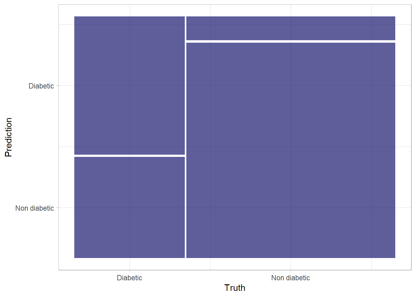
tidymodels provides yet another succinct way of evaluating all these metrics. Using yardstick::metric_set(), you can combine multiple metrics together into a new function that calculates all of them at once.
# Combine metrics and evaluate them all at once
eval_metrics <-
  metric_set(ppv, recall, accuracy, f_meas)


eval_metrics(
  data = results,
  truth = diabetic,
  estimate = .pred_class
  )
# A tibble: 4 x 3
.metric .estimator .estimate
<chr> <chr> <dbl>
1 ppv binary 0.754
2 recall binary 0.577
3 accuracy binary 0.789
4 f_meas binary 0.654Until now, we’ve considered the predictions from the model as being either 1 or 0 class labels. Actually, things are a little more complex than that. Statistical machine learning algorithms, like logistic regression, are based on probability; so what actually gets predicted by a binary classifier is the probability that the label is true \(P(y)\) ) and the probability that the label is false \(1−P(y)\). A threshold value of 0.5 is used to decide whether the predicted label is a 1 \(P(y)>0.5\) or a 0 \(P(y)<=0.5\). Let’s see the probability pairs for each case:
# Predict class probabilities and bind them to results
results <- results %>%
  bind_cols(logreg_fit %>%
              predict(new_data = diabetes_test, type = "prob"))


# Print out the results
results %>%
  slice_head(n = 10)
# A tibble: 10 x 4
diabetic .pred_class .pred_Diabetic `.pred_Non diabetic`
<fct> <fct> <dbl> <dbl>
1 Non diabetic Non diabetic 0.417 0.583
2 Non diabetic Non diabetic 0.0985 0.902
3 Non diabetic Non diabetic 0.0469 0.953
4 Non diabetic Non diabetic 0.0561 0.944
5 Diabetic Diabetic 0.581 0.419
6 Non diabetic Non diabetic 0.331 0.669
7 Non diabetic Non diabetic 0.288 0.712
8 Diabetic Non diabetic 0.270 0.730
9 Non diabetic Non diabetic 0.275 0.725
10 Non diabetic Non diabetic 0.131 0.869The decision to score a prediction as a 1 or a 0 depends on the threshold to which the predicted probabilities are compared. If we were to change the threshold, it would affect the predictions; and therefore change the metrics in the confusion matrix. A common way to evaluate a classifier is to examine the true positive rate (which is another name for recall) and the false positive rate \((1 - specificity)\) for a range of possible thresholds. These rates are then plotted against all possible thresholds to form a chart known as a received operator characteristic (ROC) chart, like this:
A receiver operating characteristic curve, or ROC curve, is a graphical plot that illustrates the diagnostic ability of a binary classifier system as its discrimination threshold is varied.
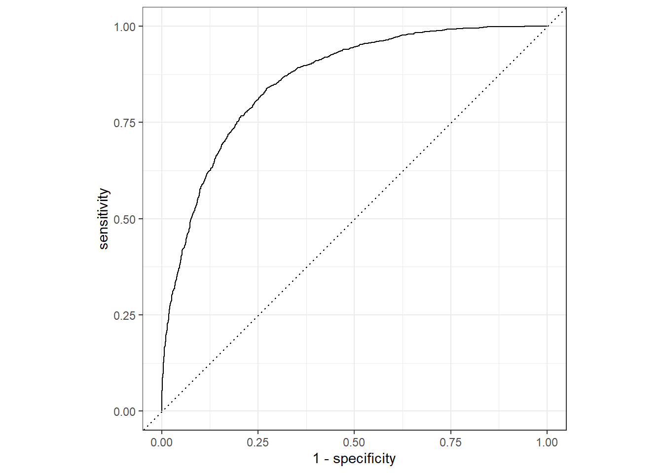
The Figure 3 shows the curve of the true and false positive rates for different threshold values between 0 and 1. A perfect classifier would have a curve that goes straight up the left side and straight across the top. The diagonal line across the chart represents the probability of predicting correctly with a \(\frac{50}{50}\) random prediction; so you obviously want the curve to be higher than that (or your model is no better than simply guessing!).
The area under the curve (AUC) is a value between 0 and 1 that quantifies the overall performance of the model. One way of interpreting AUC is as the probability that the model ranks a random positive example more highly than a random negative example. The closer to 1 this value is, the better the model. Once again, tidymodels includes a function to calculate this metric: yardstick::roc_auc()
Random Forest Algorithm
We have been dealing with logistic regression, which is a linear algorithm. tidymodels provide a swift approach to change algorithms in the model. For instance , we can change the logistic regression to other kind of classification algorithms inluding:
- Support Vector Machine algorithms: Algorithms that define a hyperplane that separates classes.
- Tree-based algorithms: Algorithms that build a decision tree to reach a prediction
- Ensemble algorithms: Algorithms that combine the outputs of multiple base algorithms to improve generalizability.
To make life simple, let us train the model using an ensemble algorithm named Random Forest that averages the outputs of multiple random decision trees. Random forests help to reduce tree correlation by injecting more randomness into the tree-growing process. More specifically, instead of considering all predictors in the data, for calculating a given split, random forests pick a random sample of predictors to be considered for that split.
Given the experience of the logistic regression model, the power of tidymodels is consistence and therefore we do not need to start over, the only thing we need to do is simply to specify and fit a random forest algorithm.
# Preprocess the data for modelling
diabetes_recipe <- recipe(diabetic ~ ., data = diabetes_train) %>%
  step_mutate(age = factor(age)) %>%
  step_normalize(all_numeric_predictors()) %>%
  step_dummy(age)

# specify a random forest model specification
rf_spec <- rand_forest() %>%
  set_engine("ranger", importance = "impurity") %>%
  set_mode("classification")

# Bundle recipe and model spec into a workflow
rf_wf <- workflow() %>%
  add_recipe(diabetes_recipe) %>%
  add_model(rf_spec)

# Fit a model
rf_wf_fit <- rf_wf %>%
  fit(data = diabetes_train)

# # spefiy the model
# rf.fit  = rand_forest() %>%
#   set_engine(engine = "ranger") %>%
#   set_mode(mode = "classification") %>%
#   # fit the model
#   fit(diabetic ~ ., data = diabetes_train)
Then we make prediction of the fitted model with the test dataset
rf.prediction = rf_wf_fit %>%
  predict(new_data = diabetes_test)

rf.prediction.prob  =  rf_wf_fit %>%
  predict(new_data = diabetes_test, type = "prob")

rf.prediction =  rf.prediction %>%
  bind_cols(rf.prediction.prob)

rf.result = diabetes_test %>%
  select(diabetic) %>%
  bind_cols(rf.prediction)

rf.result
# A tibble: 4,500 x 4
diabetic .pred_class .pred_Diabetic `.pred_Non diabetic`
<fct> <fct> <dbl> <dbl>
1 Non diabetic Non diabetic 0.275 0.725
2 Non diabetic Non diabetic 0.0137 0.986
3 Non diabetic Non diabetic 0.00739 0.993
4 Non diabetic Non diabetic 0.0108 0.989
5 Diabetic Diabetic 0.910 0.0902
6 Non diabetic Non diabetic 0.103 0.897
7 Non diabetic Non diabetic 0.237 0.763
8 Diabetic Non diabetic 0.270 0.730
9 Non diabetic Non diabetic 0.0484 0.952
10 Non diabetic Non diabetic 0.0326 0.967
# ... with 4,490 more rowsThe printed predicted of the random forest looks complelling, let’s evaluate its metrics!
              Truth
Prediction     Diabetic Non diabetic
  Diabetic         1368           99
  Non diabetic      186         2847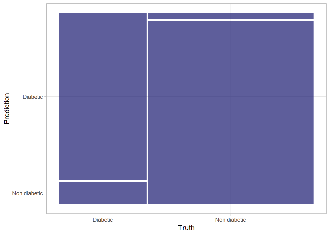
We notice that there a considerable increase in the number of True Positives and True Negatives, which is a step in the right direction. Let’s take a look at other evaluation metrics
# A tibble: 1 x 3
  .metric  .estimator .estimate
  <chr>    <chr>          <dbl>
1 accuracy binary         0.937
There is considerable improvement of the accuracy from .75 to around 0.93. The high accuracy of the random forest is also clearly visible in ROC curve (Figure 4) with considervable high value of area under the curve (AUC).
roc.values = rf.result %>%
  roc_auc(truth = diabetic, .pred_Diabetic) %>%
  pull(.estimate) %>%
  round(2)

rf.result %>%
  roc_curve(truth = diabetic, .pred_Diabetic) %>%
  autoplot()+
  annotate(geom = "text", x = .75, y = .25, label = paste("AUC-value = ", roc.values))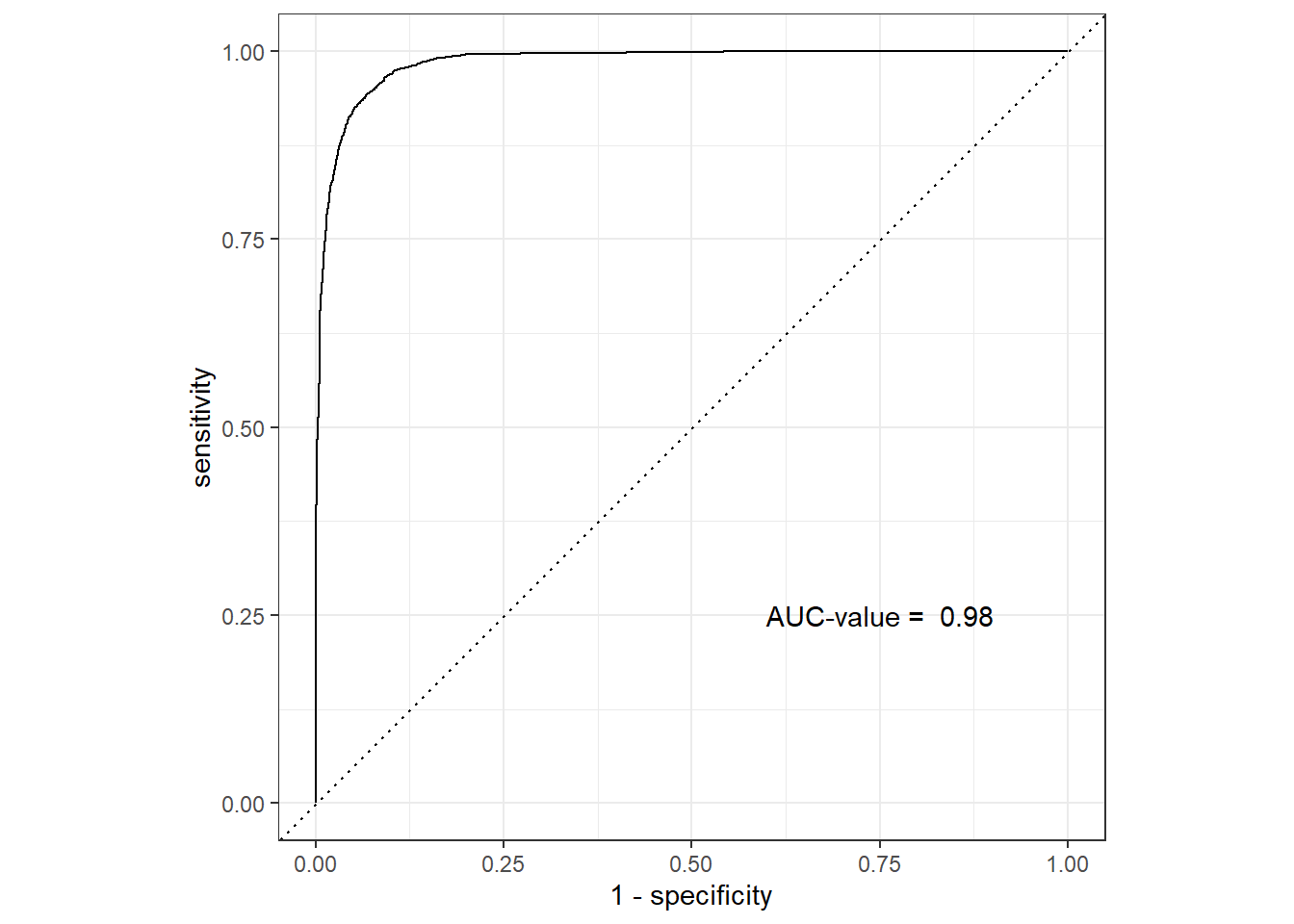
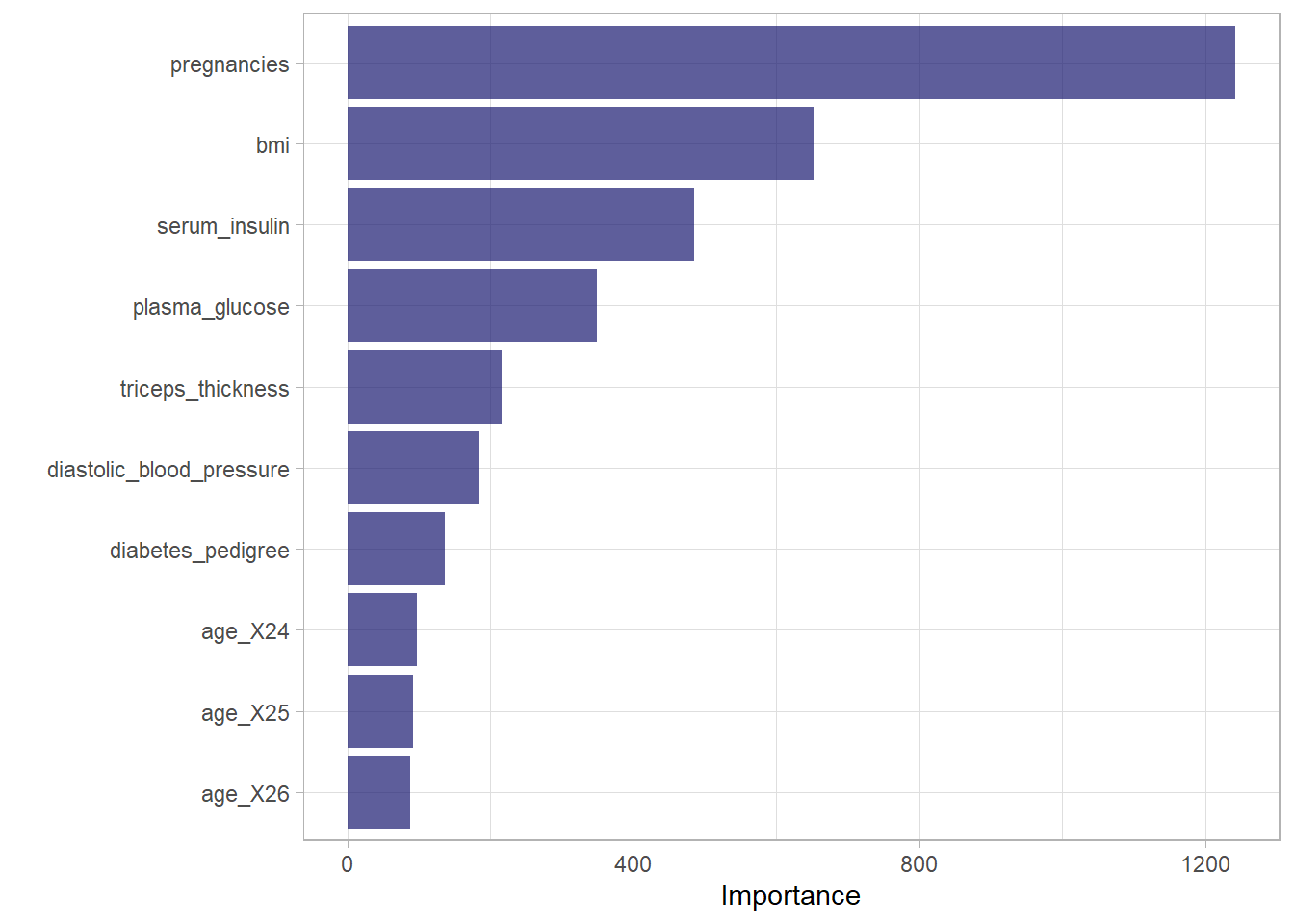
Figure 5 is a Variable Importance Plot (VIP) that illustrates importance of each predictor variables used to predict the diabetic outcome in a random forest model.
Summary
We notice that random forest has high predictive power compared to the logistic regression model and hence you can choose the model that give you high accuracy in prediction. The random forest lines of code is bunded in single chunk;
## spliting
my.split = diabetes.tidy %>%
  initial_split(prop = .8)
## test set
my.test = my.split %>%  testing()
## train set
my.train = my.split %>% training()

# spefiy the model
my.fit  = rand_forest() %>%
  set_engine(engine = "ranger") %>%
  set_mode(mode = "classification") %>%
  # fit the model
  fit(diabetic ~ ., data = my.train)

# test the model
my.prediction = my.fit %>%
  predict(new_data = my.test)

my.prediction.prob  =  my.fit %>%
  predict(new_data = my.test, type = "prob")

my.prediction =  my.prediction %>%
  bind_cols(my.prediction.prob)

my.result = my.test %>%
  select(diabetic) %>%
  bind_cols(my.prediction)

# validate the model

my.result %>%
  conf_mat(truth = diabetic, estimate = .pred_class)

my.result %>%
  accuracy(truth = diabetic, estimate = .pred_class)

# Combine metrics and evaluate them all at once
eval_metrics <-
  metric_set(ppv, recall, accuracy, f_meas)


eval_metrics(
  data = my.result,
  truth = diabetic,
  estimate = .pred_class
  )

## plotting

my.result %>%
  roc_curve(truth = diabetic, .pred_Diabetic) %>%
  autoplot()

my.result %>%
  roc_auc(truth = diabetic, .pred_Diabetic)