Streamlines for Surface Currents in Coastal Waters of Western Indian Ocean Region

Streamline
Streamlines are imaginary lines that are tangent to the velocity vector at every point in space. They represent the path that a fluid particle would follow if it were released into the flow. The density of streamlines represents the speed of the fluid at each point.
Streamlines are a powerful visualization tool used to understand fluid flow patterns. They are a series of lines that show the direction and magnitude of fluid motion at every point in space. Streamlines are commonly used in fields such as aerodynamics, hydrodynamics, and meteorology to analyze and visualize fluid flow patterns.
In this blog post, we will describe how to plot streamlines for surface current using R language. We will use the coastal waters of the Western Indian Ocean region as a case study, using drifter data from GDP. I will show you how to visualize vector field of ocean surface current using the ggplot2 package (Wickham, 2016).
I will further highlight the drawbacks of the default geom of ggplot2 and why sometimes ggplot2 functions fail to produce elegant oceanographic plots. Last I will illustrate the use of alternative geoms from metR package (Campitelli, 2019) to overcome the challenges inherited in ggplot2 package.
In R, loading packages is an essential step to access additional functionality and tools for data manipulation, visualization, and analysis. The chunk below load the packages needed in this post;
We aslo need a basemap for our area of interest. I simply load the world map spatial object from the spData package and then uses the sf package’s st_crop() function to extract a the East African land mass of the world map based on specified minimum and maximum values for the longitude and latitude coordinates. The resulting spatial object, wio, represents the cropped WIO region area.
Dataset
To illustrate the concept, I am going to use drifter data from Global Drifter Program (GDP). Drifters are oceanographic instruments that are used to track the movement of surface currents. They consist of a buoy that floats on the ocean’s surface, and a drogue that is attached to the buoy and trails behind it at a depth of 15 meters. The drogue is designed to move with the water, providing an accurate measurement of the surface current.
The Drifter dataset comprises information on surface current velocity associated with geographical locations. This spatial data allows us to gain insights into the distribution of high-speed and low-speed currents in the ocean. Visualizing this data within a geospatial context, such as displaying it on an accurate map, is beneficial. I have filtered the data to focus on the western region of the tropical Indian Ocean. I have organized and structured the drifter information into a data frame, which is a tabular representation consisting of variables (columns) and observations (rows). The dataset encompasses surface current observations worldwide, collected by the Global Drifter Program across major oceans. The Table 1 displays some of the variables included in the dataset.
- id: a unique number of drifter
- lon: longitude information
- lat: latitude information
- year, month, day, hour of the drifter records
- u: the zonal component of surface current
- v: the meridional component of the surface current
load("drifter_split.RData")


drifter.split%>%
  select(-c(drogue, season, sst)) %>%
  sample_n(12) %>%
  knitr::kable(format = "html",caption = "A sample of drifter dataset", digits = 2, align = "c")%>%
  kableExtra::column_spec(column = 1:9, width = "3cm")%>%
kableExtra::add_header_above(c("", "Location" = 2, "Date Records" = 4, "Current" = 2))| id | lon | lat | year | month | day | hour | u | v |
|---|---|---|---|---|---|---|---|---|
| 114807 | 51.19 | -16.58 | 2013 | 6 | 7 | 0 | 0.23 | 0.19 |
| 63945810 | 50.99 | -4.53 | 2017 | 12 | 30 | 18 | 0.53 | 0.52 |
| 64726990 | 40.03 | -6.82 | 2017 | 7 | 1 | 18 | -0.64 | 1.40 |
| 109535 | 47.32 | -5.43 | 2014 | 11 | 20 | 18 | -0.13 | -0.26 |
| 9727912 | 42.50 | -9.83 | 1998 | 10 | 3 | 6 | -0.08 | 0.16 |
| 25006 | 52.43 | -11.27 | 2001 | 8 | 5 | 12 | -0.27 | 0.11 |
| 63356010 | 45.10 | -6.74 | 2017 | 4 | 16 | 18 | 0.64 | 0.16 |
| 63816 | 51.43 | -4.45 | 2009 | 10 | 23 | 12 | 0.17 | 0.31 |
| 45979 | 44.52 | -12.50 | 2005 | 5 | 14 | 0 | -0.37 | -0.19 |
| 52953 | 47.45 | -11.91 | 2005 | 1 | 16 | 12 | -0.09 | -0.11 |
| 63071 | 50.12 | -4.17 | 2008 | 1 | 10 | 18 | 0.15 | -0.13 |
| 61478290 | 53.84 | -12.38 | 2016 | 1 | 4 | 18 | -0.32 | -0.03 |
The drifter observations in the specified area, as illustrated in Figure 1, were randomly scattered. To facilitate analysis and visualization, it is necessary to apply binning, which involves creating a grid with equally sized cells across the area. This binning process enables the organization of observations into a structured grid, allowing for easier interpretation and further exploration of the data.
ggplot() +
  geom_point(data = drifter.split %>% filter(season == "SE") %>%
               sample_frac(.05), aes(x = lon, y = lat))+
  geom_sf(data = wio, fill = "lightgrey", col = "black")+
  coord_sf(ylim = c(-12.5,-3), xlim = c(36, 48))+
  theme_bw()+
  theme(axis.text = element_text(size = 12, colour = 1))+
  labs(x = "", y = "")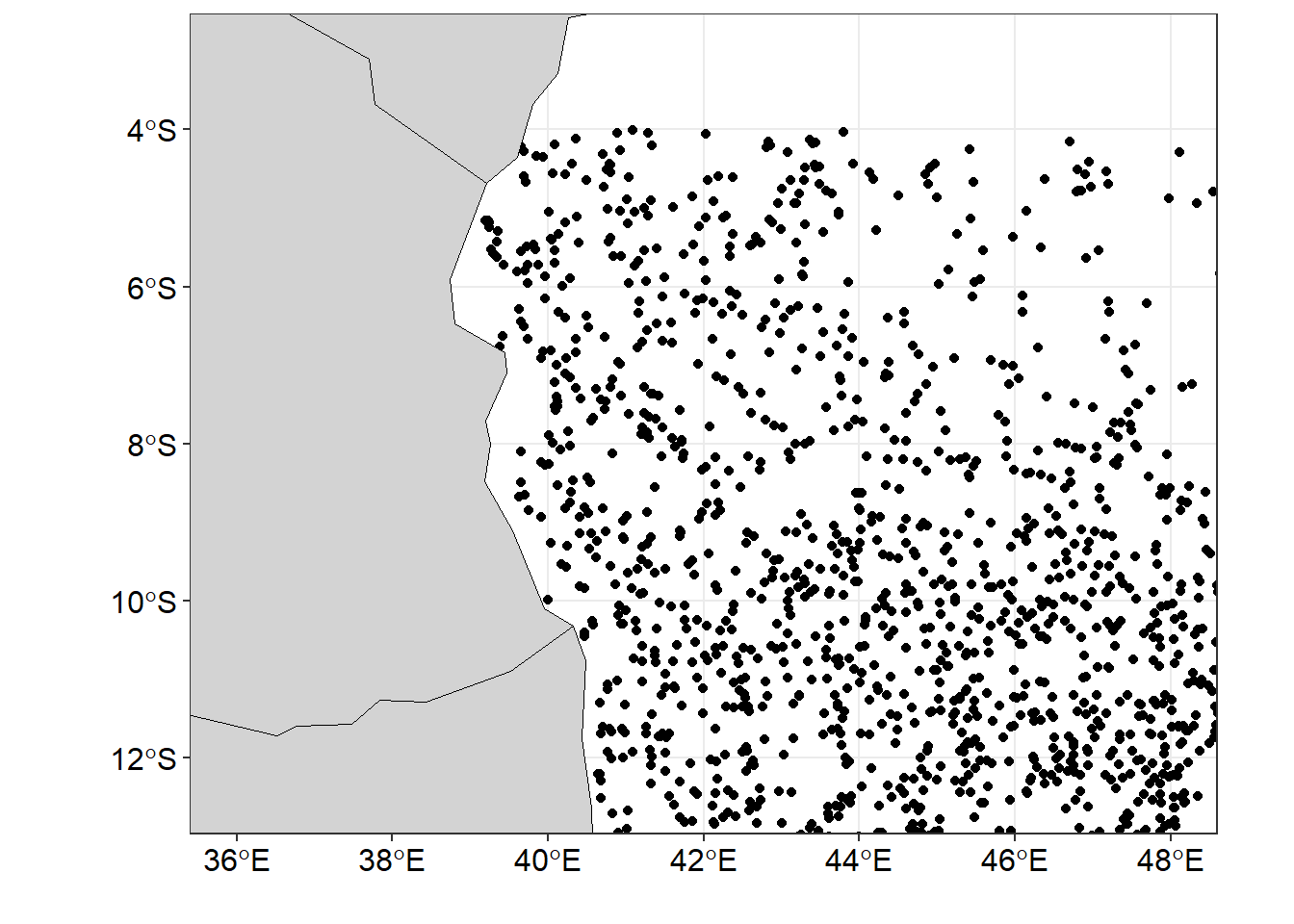
Binning
To plot streamlines in R, we first need to create a grid of points that covers the area of interest. We can do this using the st_make_grid function from the sf package. The st_make_grid function takes two vectors as input and returns the area divided into equal size grids show in in Figure 2.
##
ggplot()+geom_sf(data = drifter.grid)+
  geom_sf(data = wio,fill = "lightgrey", col = "black")+
  coord_sf(ylim = c(-12.5,-4.5), xlim = c(36, 48))+
  theme_bw()+
  theme(axis.text = element_text(size = 12, colour = 1))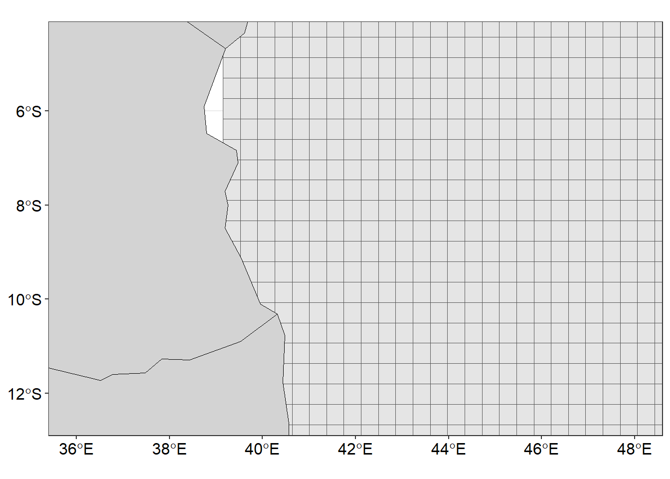
Subsequently, after performing the binning process to organize the randomly distributed drifter observations into a grid, we can proceed with further computations. Specifically, we can calculate the number of drifters present in each individual grid cell, providing valuable insights into the density and distribution patterns across the area. Additionally, we can analyze the binned observations to determine the mean zonal (east-west) and meridional (north-south) velocity fields. Since we have split drifter data into northeast (NE) and southeast (SE) monsoon season, let’s begin with NE season;
drifter.split.sf.ne = drifter.split.sf%>% filter(season =="NE")

drifter.gridded = drifter.grid %>%
  mutate(id = 1:n(),
         contained = lapply(st_contains(st_sf(geometry),drifter.split.sf.ne),identity),
         obs = sapply(contained, length),
         u = sapply(contained, function(x) {median(drifter.split.sf.ne[x,]$u, na.rm = TRUE)}),
         v = sapply(contained, function(x) {median(drifter.split.sf.ne[x,]$v, na.rm = TRUE)}))

drifter.gridded = drifter.gridded %>%
  select(obs, u, v) %>%
  na.omit()

coordinates = drifter.gridded %>%
  st_centroid() %>%
  st_coordinates() %>%
  as_tibble() %>% rename(x = X, y = Y)

st_geometry(drifter.gridded) = NULL

current.gridded.ne = coordinates %>%
  bind_cols(drifter.gridded)%>%
  mutate(season = "NE")
Then, the same process is done for the southeast monsoon season
drifter.split.sf.se = drifter.split.sf%>% filter(season=="SE")

drifter.gridded = drifter.grid %>%
  mutate(id = 1:n(), contained = lapply(st_contains(st_sf(geometry),drifter.split.sf.se),identity),
         obs = sapply(contained, length),
         u = sapply(contained, function(x) {median(drifter.split.sf.se[x,]$u, na.rm = TRUE)}),
         v = sapply(contained, function(x) {median(drifter.split.sf.se[x,]$v, na.rm = TRUE)}))


drifter.gridded = drifter.gridded %>%
  select(obs, u, v) %>%
  na.omit()

## obtain the centroid coordinates from the grid as table
coordinates = drifter.gridded %>%
  st_centroid() %>%
  st_coordinates() %>%
  as_tibble() %>%
  rename(x = X, y = Y)

## remove the geometry from the simple feature of gridded drifter dataset
st_geometry(drifter.gridded) = NULL

## stitch together the extracted coordinates and drifter information int a single table for SE monsoon season
current.gridded.se = coordinates %>%
  bind_cols(drifter.gridded) %>%
  mutate(season = "SE")

## bind the gridded table for SE and NE
## Note that similar NE follow similar procedure, hence not shown in the post
drifter.current.gridded = current.gridded.ne %>%
  bind_rows(current.gridded.se)
Upon analyzing the number of observations and velocity field within each grid cell, it became evident that certain grids lacked any drifter observations. To ensure smooth visualization, it was crucial to address this issue by filling these empty grids with appropriate U and V values. To accomplish this, an interpolation technique was employed. By applying interpolation, the missing U and V values were estimated for the empty grids, enabling a more seamless visualization of the data. The provided code chunk highlights the implementation of the interpolation process.
## select grids for SE season only
drf.se = drifter.current.gridded %>%
  filter(season == "SE")

## interpolate the U component
u.se = interpBarnes(x = drf.se$x, y = drf.se$y, z = drf.se$u)

## obtain dimension that determine the width (ncol) and length (nrow) for tranforming wide into long format table
dimension = data.frame(lon = u.se$xg, u.se$zg) %>% dim()

## make a U component data table from interpolated matrix
u.tb = data.frame(lon = u.se$xg,
                  u.se$zg) %>%
  gather(key = "lata", value = "u", 2:dimension[2]) %>%
  mutate(lat = rep(u.se$yg, each = dimension[1])) %>%
  select(lon,lat, u) %>% as.tibble()

## interpolate the V component
v.se = interpBarnes(x = drf.se$x,
                    y = drf.se$y,
                    z = drf.se$v)

## make the V component data table from interpolated matrix
v.tb = data.frame(lon = v.se$xg, v.se$zg) %>%
  gather(key = "lata", value = "v", 2:dimension[2]) %>%
  mutate(lat = rep(v.se$yg, each = dimension[1])) %>%
  select(lon,lat, v) %>%
  as.tibble()
Once the zonal and meridional velocities have been filled in the grids, it becomes possible to calculate the velocity field at each individual grid point. This can be achieved by computing the magnitude of the velocity vector using the equation:
\[
vel = \sqrt{v^2 + u^2}
\] In this equation, the variable v represents the meridional velocity component, while u represents the zonal velocity component. By taking the square root of the sum of the squares of these components, we obtain the magnitude of the velocity vector, denoted as vel. This magnitude represents the overall speed or intensity of the velocity at each point in the grid, providing valuable insights into the spatial variations and patterns of the velocity field. The provided code chunk highlights the computation of the velocity field.
The code takes two data frames, u.tb and v.tb, and combines them into a new data frame and compute the velocity of the surface current and store them in a new column called ve from the corresponding values from the u and v columns.
Visualising Vector field
Figure 3 was made with ggplot2 package. The smoothed velocity grid was created with the geom_raster() function and the vector field showing the direction and speed superimposed on the current velocity was done with the segment() function. You notice that these geoms did a wonderful job and the figure is surface current speed and direction are clearly distinguished with the arrow and the length of the arrow. The code used to create Figure 3 are shown in the chunk below.
ggplot() +
  geom_raster(data = uv.se, aes(x = lon, y = lat, fill = vel), interpolate = TRUE)+
  geom_segment(data = uv.se, aes(x = lon, xend = lon + u/1.2, y = lat, yend = lat+v/1.2),
               arrow = arrow(angle = 20, length = unit(.2, "cm"), type = "open"))+
  geom_sf(data = wio,fill = "lightgrey", col = "black")+
  coord_sf(ylim = c(-12.5,-4.5), xlim = c(38, 48))+
  scale_fill_gradientn(name = "Current",colours = oceColorsVelocity(120),
                       limits = c(0,1.6), breaks = seq(0.1,1.6,.3),
                       guide = guide_colorbar(barwidth = .8, barheight = 15,
                                              title = expression(Current~speed~(ms^{-1})),
                                              title.position = "right", title.hjust = .5,
                                              title.theme = element_text(angle = 90)))+
  theme_bw()+
  theme(legend.position = "right",
        legend.key.height = unit(1.4, "cm"),
        legend.background = element_blank(),
        axis.text = element_text(size = 12, colour = 1))+
  labs(x = "", y = "")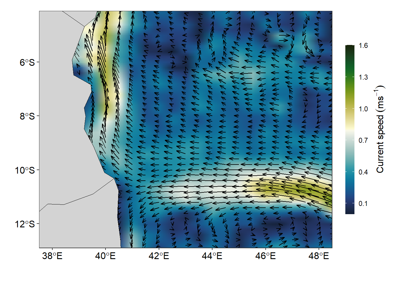
To plot the streamlines, i used geom_streamline() from metR package (Campitelli, 2019). The geom_streamline() function takes the x and y coordinates of each point on the grid and the x and y components of the velocity vector as input and generates the streamlines.
ggplot() +
  metR::geom_contour_fill(data = uv.se, aes(x = lon, y = lat, z = vel),
                          na.fill = TRUE, bins = 70) +
  metR::geom_streamline(data = uv.se,
                        aes(x = lon, y = lat, dx = u, dy = v),
                        L = .9, res = 4, n = 40, jitter = 4)+
  geom_sf(data = wio,fill = "lightgrey", col = "black")+
  coord_sf(ylim = c(-12.5,-4.5), xlim = c(38, 48))+
  scale_fill_gradientn(name = "Current",colours = oceColorsVelocity(120),
                       limits = c(0,1.6), breaks = seq(0.1,1.6,.3),
                       guide = guide_colorbar(barwidth = .8, barheight = 15,
                                              title = expression(Current~speed~(ms^{-1})),
                                              title.position = "right", title.hjust = .5,
                                              title.theme = element_text(angle = 90)))+
  theme_bw()+
  theme(legend.position = "right",
        legend.key.height = unit(1.4, "cm"),
        legend.background = element_blank(),
        axis.text = element_text(size = 12, colour = 1))+
  labs(x = "", y = "")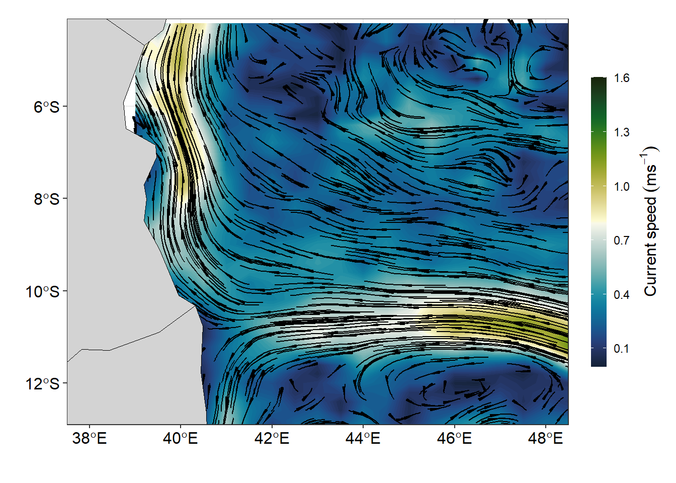
Conclusion
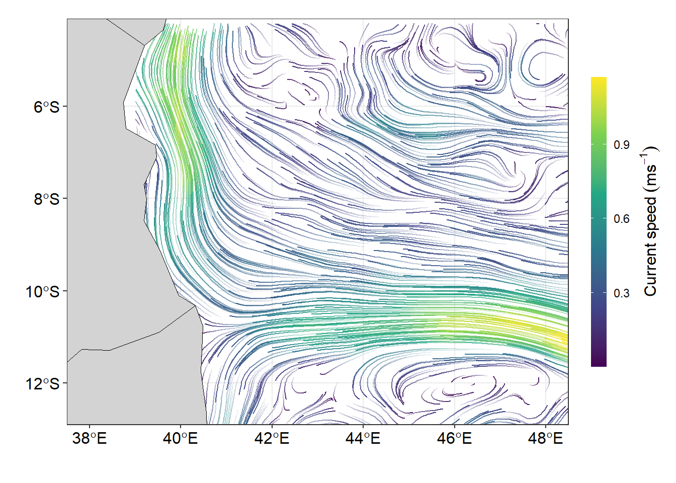
Many Oceanographic data are defined in a longitude–latitude grid and and though geom_raster() and geom_segment() plot these field well, but the function from metR package extend the use of ggplot to deal well with oceanographical data and produce graphics that meet the standard. The massless flow of surface current are much clear when stremline are used to plot the figure (Figure 5). The lines of codes used to make Figure 5 are shown in the chunk below.
ggplot()+
metR::geom_streamline(data = uv.se,
                        aes(x = lon, y = lat, dx = u, dy = v,
                            color = sqrt(..dx..^2 + ..dy..^2),
                            alpha = ..step..),
                      L = 2, res = 2, n = 40,
                      arrow = NULL, lineend = "round")+
  geom_sf(data = wio,fill = "lightgrey", col = "black")+
  coord_sf(ylim = c(-12.5,-4.5), xlim = c(38, 48))+
  scale_color_viridis_c(
    guide = guide_colorbar(barwidth = .8, barheight = 15,
                           title = expression(Current~speed~(ms^{-1})),
                           title.position = "right", title.hjust = .5,
                           title.theme = element_text(angle = 90)))+
  scale_size(range = c(0.2, 1.5), guide = "none") +
  scale_alpha(guide = "none") +
  theme_bw()+
  theme(legend.position = "right",
        legend.key.height = unit(1.4, "cm"),
        legend.background = element_blank(),
        axis.text = element_text(size = 12, colour = 1))+
  labs(x = "", y = "")