plotting in Python with Seaborn: box plot

Introduction
In Visualization with Seaborn of this series, we were introduced on the power visualization and dove into distributions plot. In this post we are going learn how to plot boxplot in seaborn. The boxplot is used to plot the quantile information of numeric variables in a dataset. To plot a box plot, the boxplot() function is used. To plot a horizontal boxplot, the variable name of the dataset is passed to the x-axis.
Loading libraries
Though most people are familiar with plotting using matplot, as it inherited most of the functions from MatLab. Python has an extremely nady library for data visualiztion called seaborn. The Seaborn library is based on the Matplotlib library. Therefore, you will also need to import the Matplotlib library.
Dataset
We are going to use a penguin dataset from palmerpenguins package (Horst, Hill, and Gorman 2020). We do not need to download this dataset as it comes with the seaborn package. We only need to load it from the package into our session using sns.load_dataset function and specify the penguins as the name of the dataset and assign it as df;
  species     island  bill_length_mm  ...  body_mass_g     sex  year
0  Adelie  Torgersen            39.1  ...         3750    male  2007
1  Adelie  Torgersen            39.5  ...         3800  female  2007
2  Adelie  Torgersen            40.3  ...         3250  female  2007
3  Adelie  Torgersen             NaN  ...  -2147483648     NaN  2007
4  Adelie  Torgersen            36.7  ...         3450  female  2007

[5 rows x 8 columns]
A printed df dataset shows that is made up of various measurements of three different penguin species — Adelie, Gentoo, and Chinstrap. The dataset contains seven variables – species, island, bill_length_mm, bill_depth_mm, flipper_length_mm, body_mass_g, sex, and year.
Boxplot
Next, we will call the boxplot() function from the Seaborn library to plot a bar plot that displays the average length of penguin species.
fig = plt.figure()
sns.boxplot(data=df, x="species", y="bill_length_mm")
plt.ylabel("Bill length (mm)")
plt.show()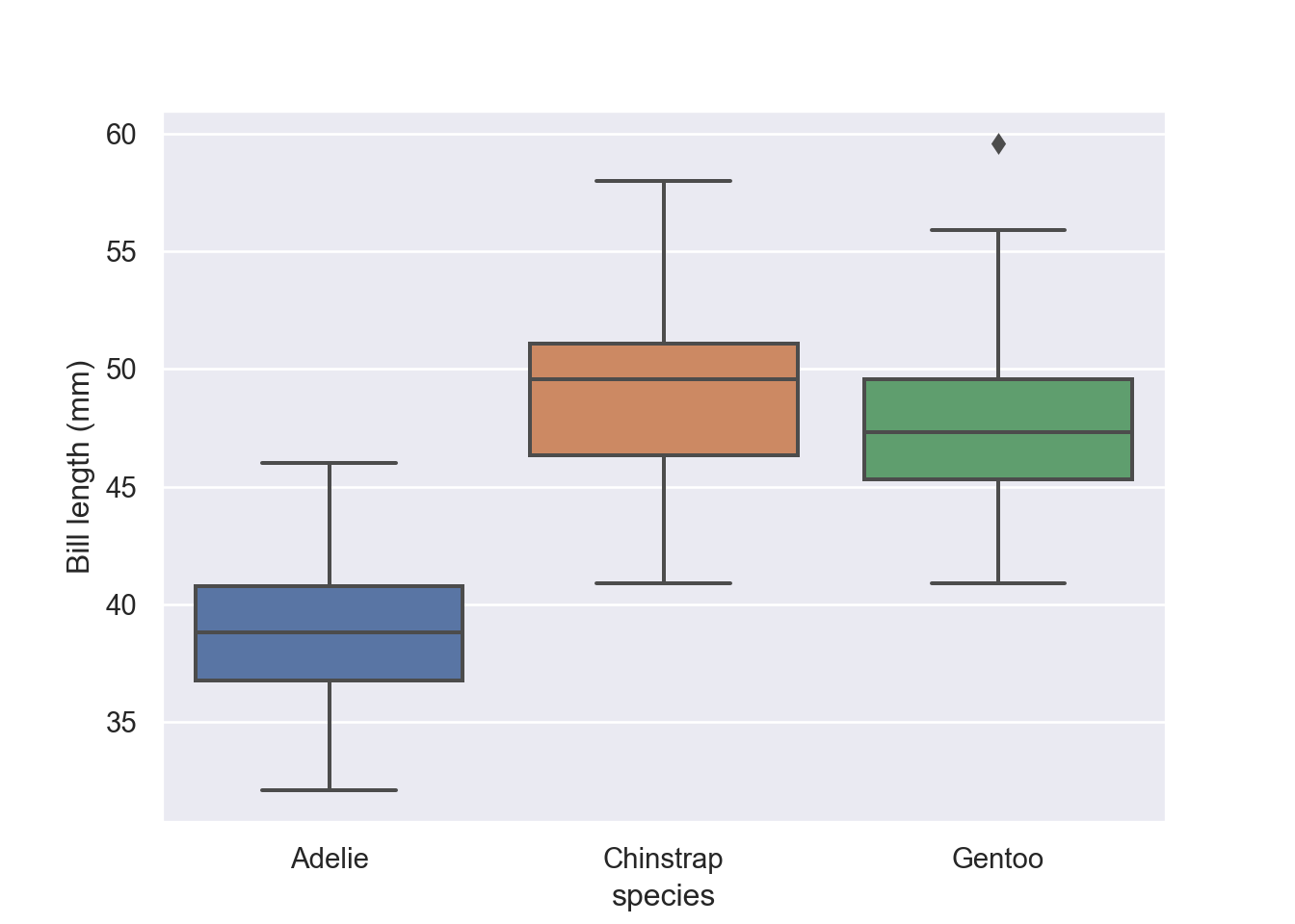
The Figure 1 shows that the average length of penguins from the three island. We can parse an argument hue = "sex" to stack the plot as Figure 2 shows.
fig = plt.figure()
sns.boxplot(data=df, x="species", y="bill_length_mm", hue = "sex")
plt.ylabel("Bill length (mm)")
plt.show()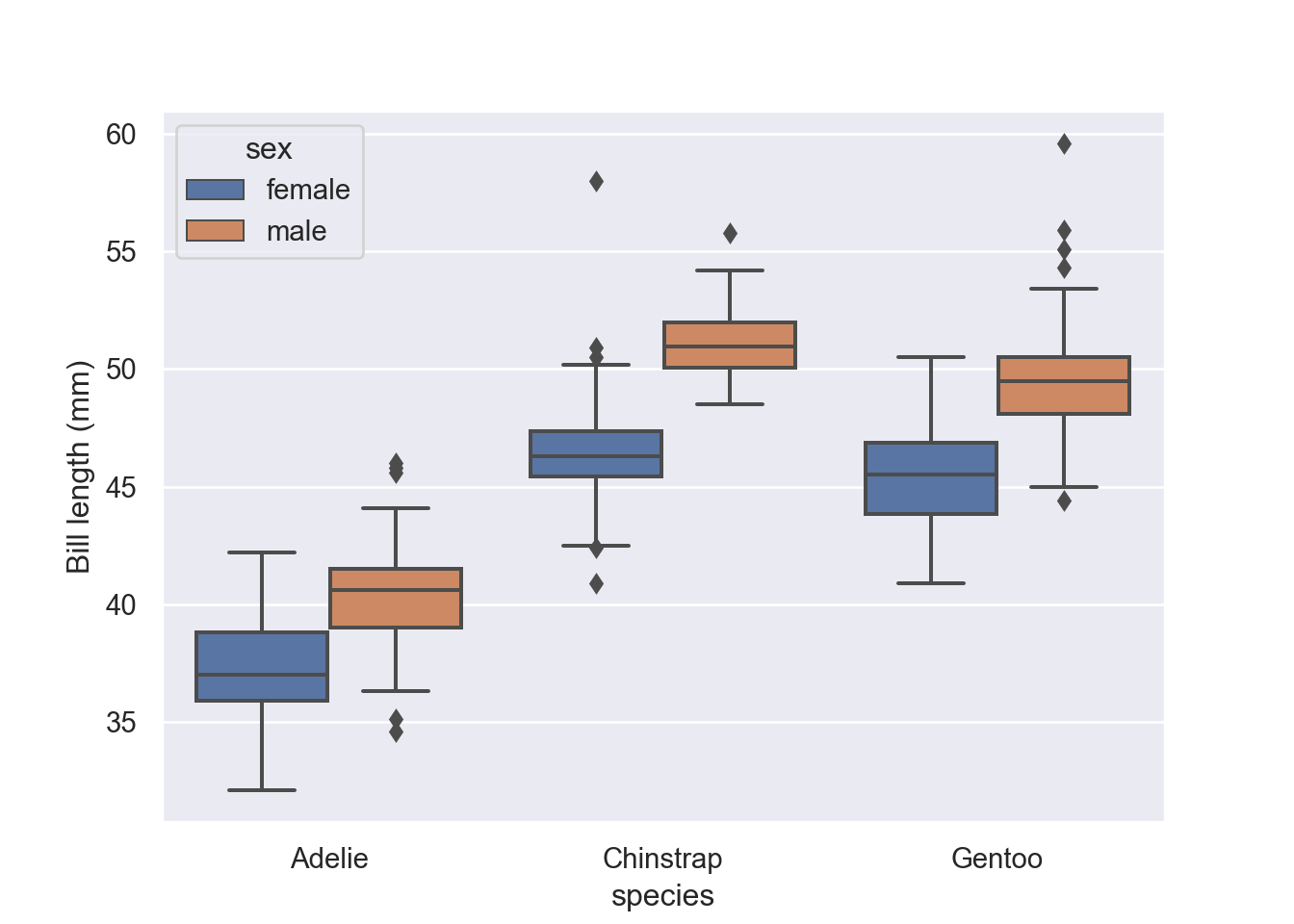
Draw a vertical boxplot with nested grouping by two variables:
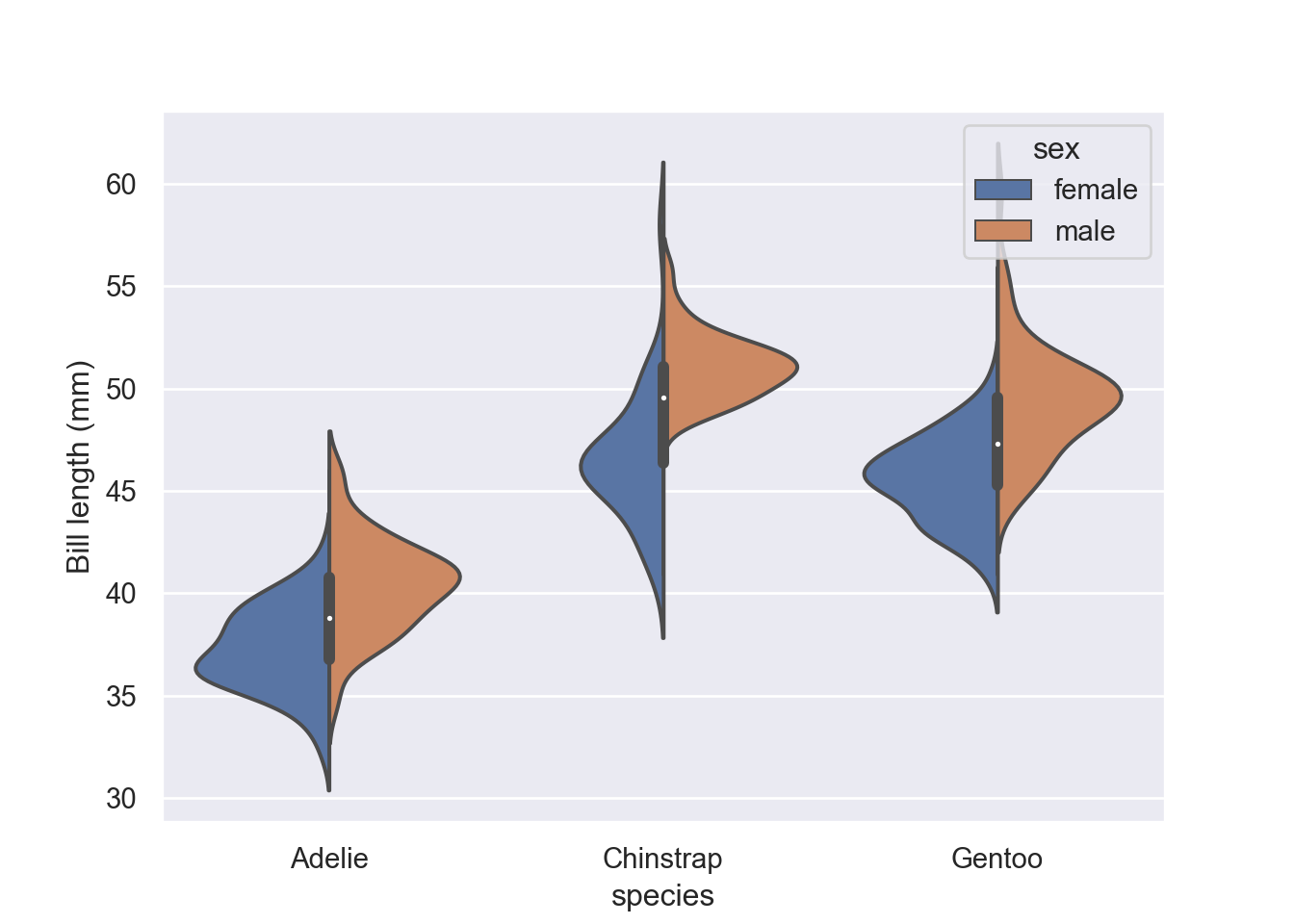
Violin
Violin plots are similar to Box plots. However, unlike Box plots that plot quantile information, the Violin plots plot the overall distribution of values in the numeric columns. The following script plots two Violin plots for the passengers traveling alone and for the passengers traveling along with another passenger. The violinplot() function is used to plot a swarm plot with Seaborn.
fig = plt.figure()
sns.violinplot(data=df, x="species", y="bill_length_mm", hue = "sex")
plt.ylabel("Bill length (mm)")
plt.show()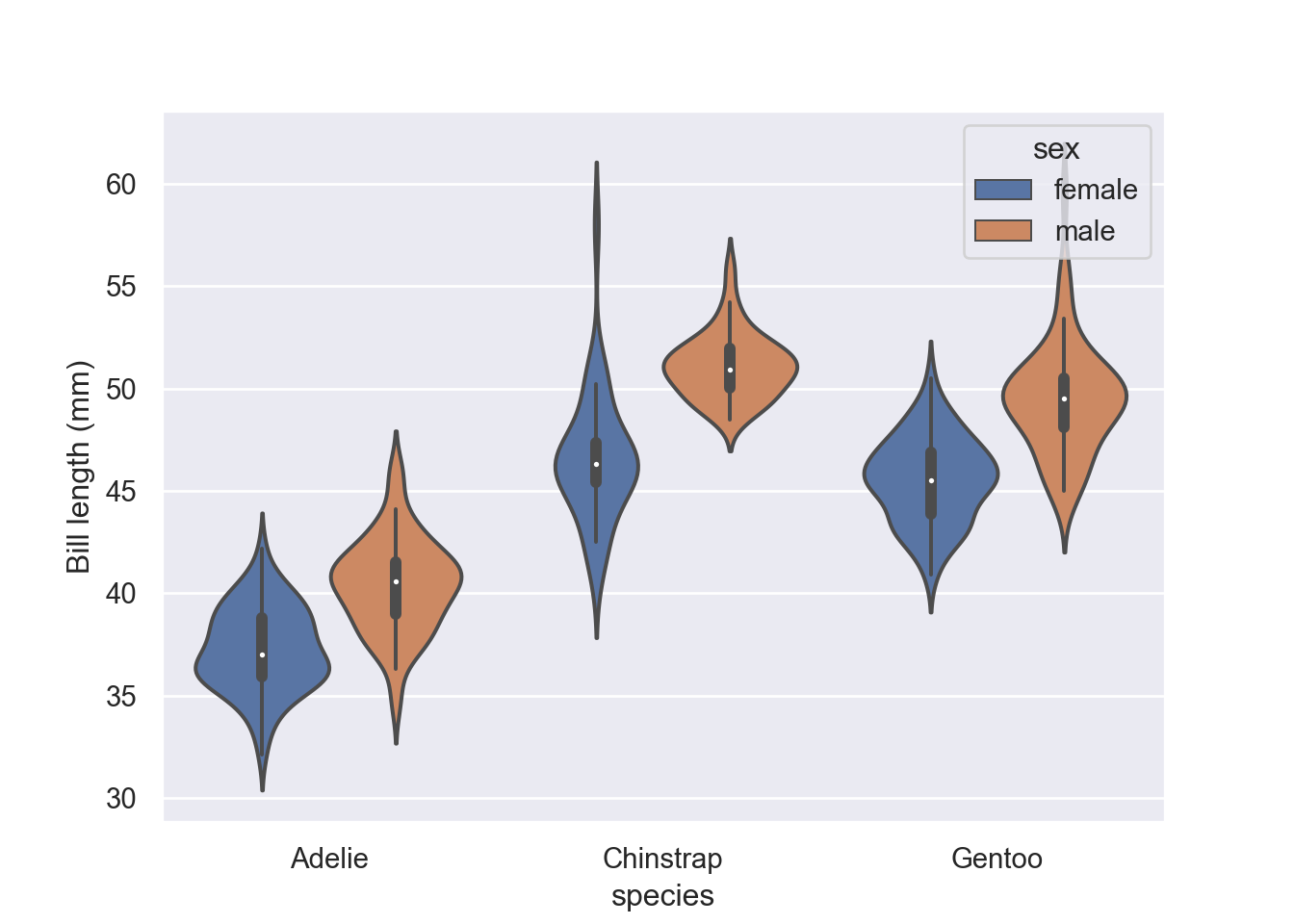
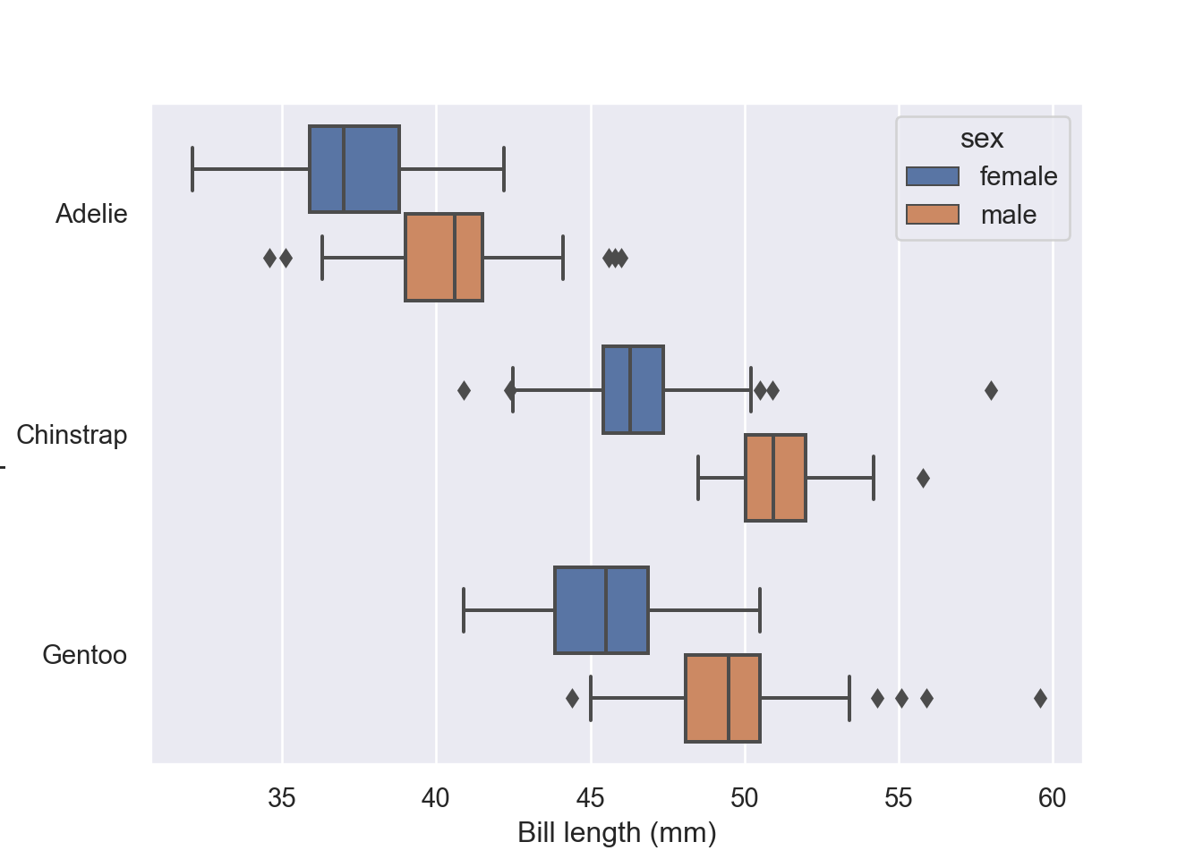
We can split the violin plot with split = True argument. One key advantage of splited violins is that take up less space (Figure 5):