Getting and Processing Satellite Data Made Easier in R

Introduction: A Brief Overview
The amount of data being generated by satellites has soared in recent years. The proliferation of remote sensing data can be explained by recent advancements in satellite technologies. However, according to Febvre1, this advancement set another challenge of handling and processing pentabyte of data satellite generates. Thanks to ERDDAP, for being in front-line to overcome this challenge. We can obtain satellite data within the geographical extent of the area we are interested. The ERDDAP server provides simple and consistent way to subset and download oceanographic datasets from satellites and buoys to your area of interest. ERDDAP is providing free public access to huge amounts of environmental datasets. Current the ERDDAP server has a list of 1385 datasets.This server allows scientist to request data of a specific area of interest in two forms—grids or tabular data.
xtractomatic is R package developed by Roy Mendelssohn2 that works with ERDDAP servers. The xtractomatic functions were originally developed for the marine science, to match up ship track and tagged animals with satellites data. Some of the satellite data includes sea-surface temperature, sea-surface chlorophyll, sea-surface height, sea-surface salinity, and wind vector. However, the package has been expanded and it can now handle gridded environmental satellite data from ERDAPP server.
In this post I will show two main routine operations extractomatic package can do. The first one is to match up drifter observation data with modis sea surface temperature satellite data using xtracto function. The second operation involves xtracto_3D to extract gridded data of sea surface temperature and chlorophyll a, both acquired by MODIS sensors.
Packages Required for the Process
Besides xtractomatic package, I am going to load other packages for data procesing and visualization. These packages include tidyverse3, lubridate4, spData5, sf6, oce7, and insol8 that I will use to manipulate, tidy, analyse and visulize the extracted SST and chl-a data from MODIS satellite. The chunk below shows the package needed to accomplish the task in this post
Area of Interest: Pemba Channel
The area we are interested in this post is the Pemba Channel, which is the deepest channel along the coastal water of Tanzania. To make a plot of this channel, we need to load into the session some of the shapefile.
To facilitate fast plotting of the map, we need also to reduce the file size by simply selecting (filter) rows with the Tanzania and Kenya polygons.
I chose the Pemba channel (Figure 1)) to demonstrate the process on how to obtain environmental and oceanographic data from ERDDAP server. Briefly, the Pemba channel is the deepest channel when compared to other two channel found in Tanzania water – Zanzibar and Mafia channels. Because of deep bottom topography, the Pemba channel is the least explored and its oceanographic informationis a hard to find. I decided to use free satellite data and open-source sofware to bring up the environmental dynamics in this important channel. The channel is known for its small pelagic fishery that support local people as source of food and income.
ggplot(data = tz.ke)+
  geom_sf(fill = "ivory", col = "black", linewidth = .2)+
  coord_sf(xlim = c(38.5, 40), ylim = c(-6,-4))+
  geom_sf_label(aes(label = country), fill = "cyan4", alpha = 1, color = "white")+
  theme_bw()+
  theme(panel.background = element_rect(colour = 1, fill = "lightblue"),
        panel.grid = element_line(colour = NA),
        axis.text = element_text(colour = 1, size = 10))+
  scale_x_continuous(breaks = seq(38.5, 40, length.out = 4)%>%round(digits = 1))+
  scale_y_continuous(breaks = seq(-5.8, -4.1,length.out = 5)%>%round(digits = 1))+
  labs(x = NULL, y = NULL)+
  geom_text(aes(x = 39.36, y = -5.2,
                label = "Pemba\nChannel"), col = "black")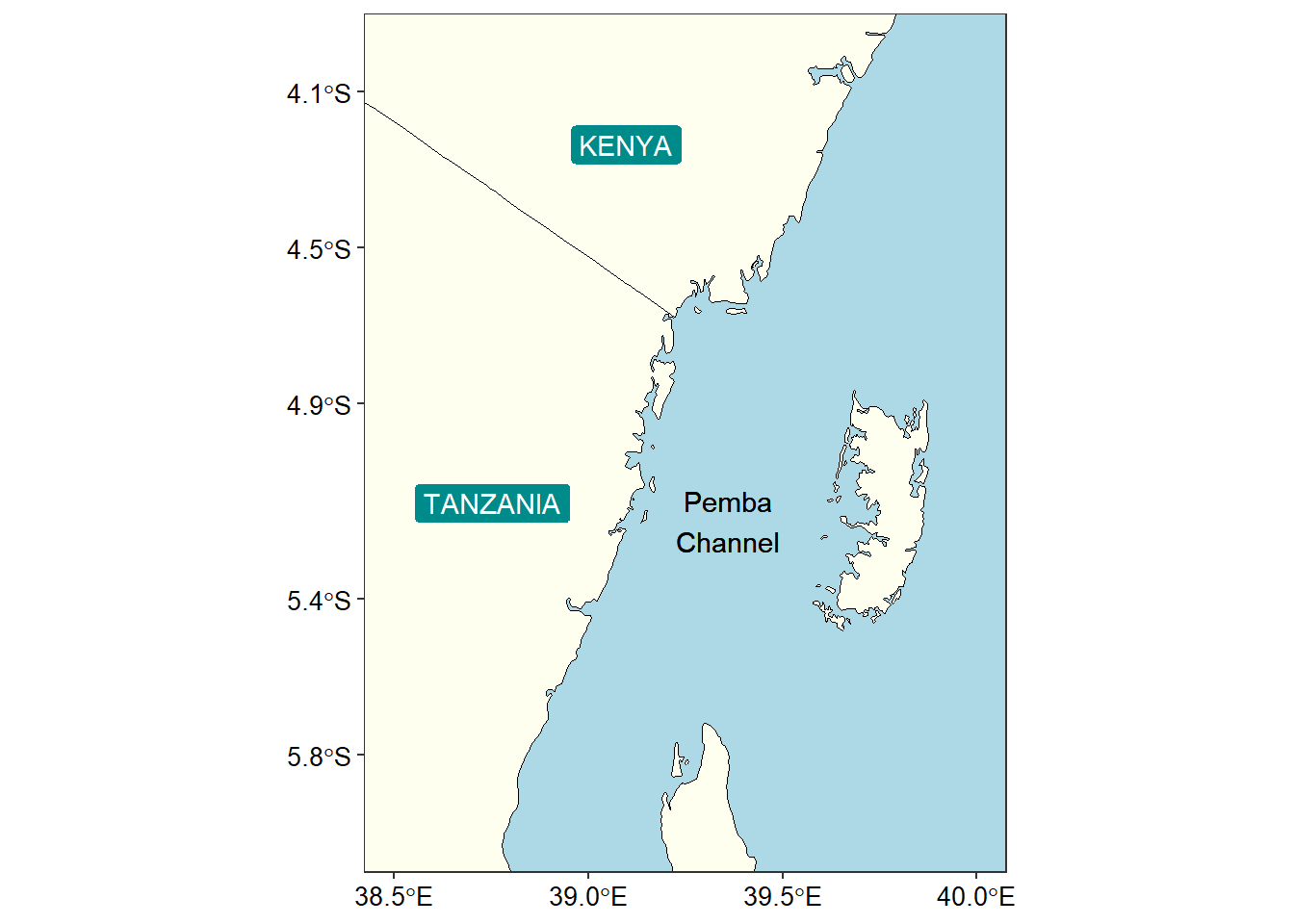
Argo Floats serve as tagging features
Argo data provide sufficient information for tracking the water masses and the physical properties of the upper layer of the world oceans. Argo float with World Meteorological Identification number 1901124 that crossed the coastal water of Tanzania was downloaded as the actual Argo NetCDF files from the Argo Data website.
Processing Argo float data I used oce package developed by Dan Kelley and Clark Richards (2022). The oce package has read.argo function that read directly NetCDF file from Argo floats. Let’s read a file;
We can explore the metadata of the argo float dataset we just imported in the session with print function
argo object, from file 'D:\semba\2023\blogs\sembaBlog\posts\data\1901124_prof.nc', has data as follows.
   time [1:217]: 2008-10-27 22:43:57, 2008-11-06 23:17:07, ..., 2014-09-27 00:06:44, 2014-10-06 23:19:51
   latitude [1:217]: -21.644, -21.280, ..., -1.723, -1.233
   longitude [1:217]: 64.030, 64.198, ..., 41.768, 42.170
   pressure, a 71x217 array with value 4.5999999 at [1,1] position
   pressureAdjusted, a 71x217 array with value 4.5999999 at [1,1] position
   pressureAdjustedError, a 71x217 array with value 2.4000001 at [1,1] position
   temperature, a 71x217 array with value 23.5470009 at [1,1] position
   temperatureAdjusted, a 71x217 array with value 23.5470009 at [1,1] position
   temperatureAdjustedError, a 71x217 array with value 0.00200000009 at [1,1] position
   salinity, a 71x217 array with value 35.3370018 at [1,1] position
   salinityAdjusted, a 71x217 array with value 35.3375397 at [1,1] position
   salinityAdjustedError, a 71x217 array with value 0.00999999978 at [1,1] position
The printed output shows that the internal structure contains latitude, longitude, pressure, temperature and salinity variables for 217 profiles. Though the processing of this file is multi-steps. However, Kelley and Richards (2022) developed a as.section function that can convert these 217 individual profiles into a single section, which is convinient for plotting
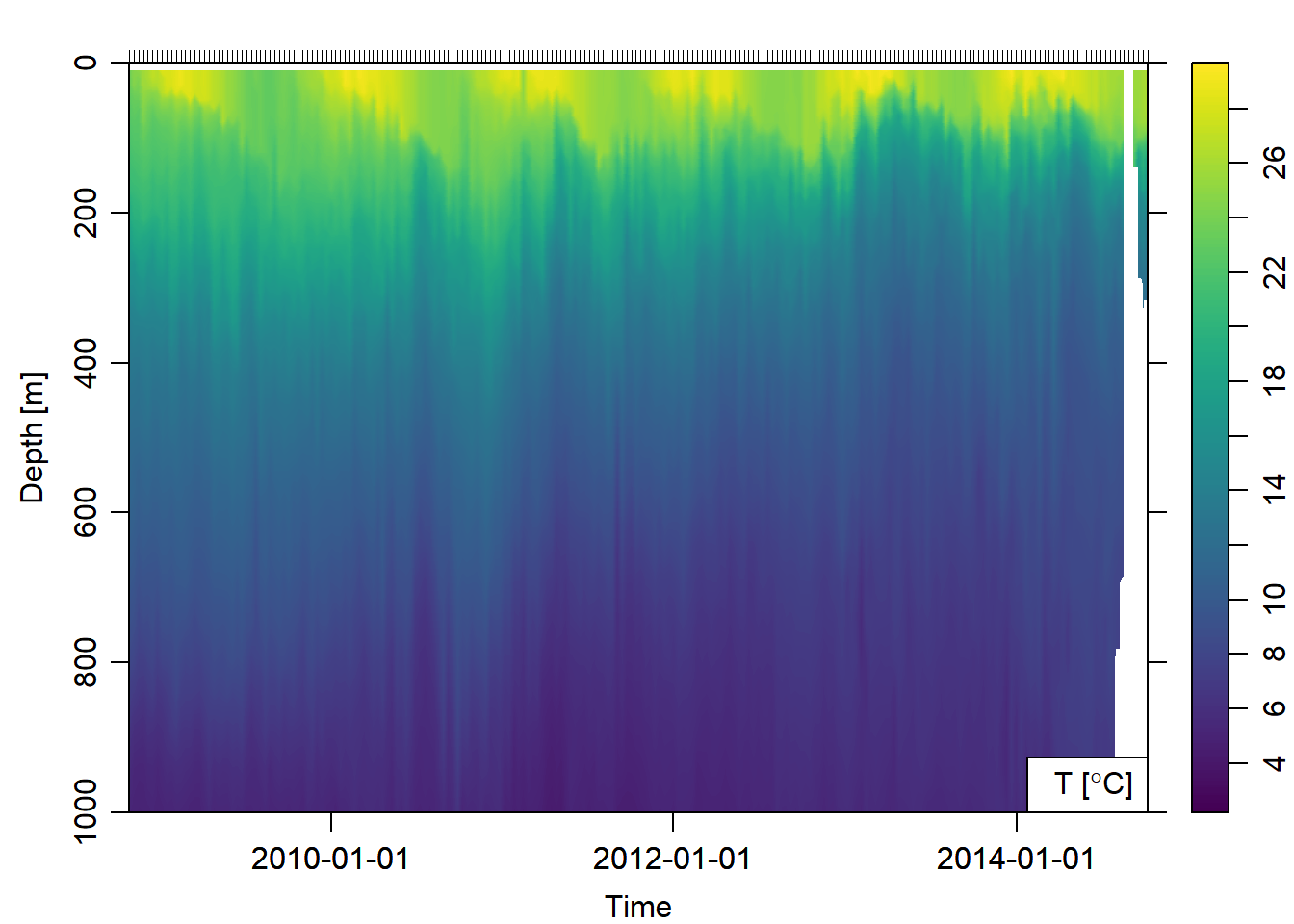
Once the argo float profile data was imported in the workspace, was converted to hydrographic section that was used to plot sections of temperature against time Figure 2)
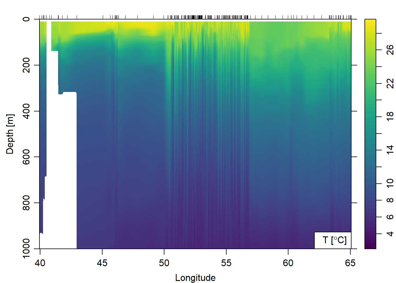
Further, we can plot temperature against longitude (Figure 3) from the surface to 1000 meter deep.
To obtain Argo floats profile within the Pemba channel, I subset based on location and drop all profiles that were outside the geographical extent of the channel.
par(mfrow = c(1,2))

pemba.argo.section = argo.section %>%
  subset(latitude > -6.1 & latitude<=-3.5 & longitude < 41)

pemba.argo.section
Unnamed section has 4 stations:
Index ID Lon Lat Levels Depth
1 208 39.951 -5.570 71 NA
2 209 39.940 -5.250 71 NA
3 210 40.103 -4.577 71 NA
4 211 40.251 -3.989 71 NAFigure 4 shows the six stations that the argo floats made vertical measurements of temperature and salinity in the offshore water of the Pemba Island during the southeast monsoon season.
par(mfrow = c(1,3))

pemba.argo.section %>%
  plot(showStations = T, which = c("map"))

pemba.argo.section %>%
  plot(ztype = "image", xtype = "latitude", ylim = c(300,0),
       showStations = T, which = c("temperature"),
       longitude = c(35, 41), zcol = oce.colors9A(120))

pemba.argo.section %>%
  plot(ztype = "image", xtype = "latitude", ylim = c(300,0),
       showStations = T, which = c("salinity"),
       longitude = c(35, 41), zcol = oce.colors9A(120))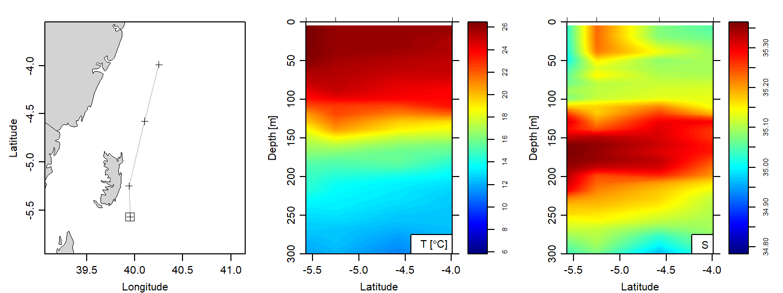
Make A tibble from Argo Section
A tibble is a modern data frame. Hadley Wickham declared that to change an old language like R and its traditional data fame that were useful 10 or 20 years ago, depend on the innovations in packages. One of those packages is the ecosystem of tidyverse that use pipe (%>%) operator and tibble for its operations. To make a tibble out of argo section. I converted the section into a list and then extracted the longitude and latitude information. I found that time is stored in the metadata slot and not the data slot. Being in different slot make it hard to extract
## convert argo section to list
argo.list = argo.section[["station"]]

## extract lon from the argo list
longitude = argo.section[["longitude", "byStation"]]

## extract lat from the argo list
latitude = argo.section[["latitude", "byStation"]]

## time can not be extracte the same way lon and lat can. This is because the time is stored in the
time = argo.section[["time", "byStation"]]
These cast are labelled with station number 206 to 2011 from 2014-06-19 to 2014-08-07. Once we have the argo list from the section dataset, we can use plot function to make temperature–salinity profile plots (Figure 5) for the five Argo profiles crossed along the offshore waters of Pemba Island.
par(mfrow = c(2,3))
argo.list[[206]]%>%plot(which = 1, type = "l")
argo.list[[207]]%>%plot(which = 1, type = "l")
argo.list[[208]]%>%plot(which = 1, type = "l")
argo.list[[209]]%>%plot(which = 1, type = "l")
argo.list[[210]]%>%plot(which = 1, type = "l")
argo.list[[211]]%>%plot(which = 1, type = "l")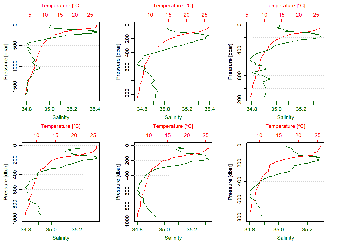
Most people are familiar with data that are arranged in tabular format where the rows represent records and columns represent variables. Therefore, we are going to convert the S3 format that is in the argo list into a spreadsheet like; the chunk below highlight how to convert the S3 profile data of profile with ID 206 to tibble
profile.01 = argo.list[[206]]@data%>%
  as.data.frame()%>%
  as.tibble()%>%
  mutate(Date = argo.list[[206]]@metadata$startTime%>%as_datetime(tz = ""),
         Longitude = argo.list[[206]]@metadata$longitude,
         Latitude = argo.list[[206]]@metadata$latitude)%>%
  separate(Date, c("Date", "Time"),sep = " ", remove = TRUE)%>%
  dplyr::select(Scan = scan, Date, Time, Longitude, Latitude,
                Depth = pressure, Temperature = temperature,
                Salinity = salinity)
Table 1 shows the temperature and salinity from the surface to 800 meter deep of station 206 at this location 7.909S 40.372E during the southeast monsoon period of 2014-06-19. Although only ten rows are visible in Table 1, you can simply the button to see more records of the dataset.
profile.01 %>%
  select(-Time) %>%
  # head(n = 10) %>%
  mutate(across(is.numeric, round, 1)) %>%
DT::datatable(rownames = FALSE)I extracted the argo float information for station 206 and there are 217 casts made by this float. We can extract them one at a time, however, that is tedious and prone to human errors but also is time consuming. The best practise recommended for programming is to tell computer to iterate through this profile and extract the records, tidy them and organize in tibble format. The chunk below contain lines of code that highlight the step involved;
argo.tb = NULL

for (i in 1:217){

  profile = argo.list[[i]] %>%
    ctdDecimate(p = 20)

argo.tb[[i]] = profile@data%>%
  as.data.frame() %>%
  as.tibble()%>%
  mutate(Date = profile@metadata$startTime%>%as_datetime(tz = ""),
         Longitude = profile@metadata$longitude,
         Latitude = profile@metadata$latitude)%>%
  separate(Date, c("Date", "Time"),sep = " ", remove = TRUE)%>%
  dplyr::select(Scan = scan, Date, Time, Longitude, Latitude,
                Depth = pressure, Temperature = temperature,
                Salinity = salinity)

}

argo.tb = argo.tb %>%
  bind_rows()
Now I have a tibble of 21105 scan from 2017 measured from the surface to the deepest part at a particular location. However, I want only the surface information of salinity, and temperature from each cast. If we plot all these rows will clutter the plot and slow down the computing of our machine. Therefore, since each profile has several hundred records depending on the depth and standard depth but all are in the same longitude and latitude, and every 10 days the floats descend to 2,000 meters and then collect a vertical profile of temperature and salinity during ascent to the surface. Therefore, we are going to group the records based on the date and slice the first record for each date.
Figure 6 shows the trajectory of the argo float overlaid on the webmap. Each points signify the profile and clicking it simply popup for you attribute information of that profile.
data("world") ## medium resolution from spData package

ggplot()+
  geom_sf(data = world, fill = "ivory", col = 1)+
  geom_path(data = argo.surface.tb,
            aes(x = Longitude, y = Latitude), size =.5, col = 2)+
  geom_point(data = argo.surface.tb, aes(x = Longitude, y = Latitude), col = 2)+
  coord_sf(xlim = c(35, 71), ylim = c(-25,0))+
  ggrepel::geom_text_repel(data = argo.surface.tb%>%slice(seq(3,217,25)),
                           aes(x = Longitude, y = Latitude, label = Date))+
  theme_bw()+
  theme(panel.background = element_rect(colour = 1, fill = "lightblue"),
        panel.grid = element_line(colour = NA),
        axis.text = element_text(colour = 1, size = 10))+
labs(x = NULL, y = NULL)require(tmap)
tmap_mode(mode = "view")
argo.surface.sf = argo.surface.tb %>%
st_as_sf(coords = c("Longitude", "Latitude"), crs = 4326)
argo.surface.sf %>%
tm_shape(name = "Argo Profiles") +
tm_dots(col = "Temperature", id = "Date",
palette = oce.colorsJet(120), n = 4,
title = "Temperature <br> (Degree C)")BONUS
argo.surface.sf %>%
  tm_shape() +
  tm_bubbles(
    size = "Temperature", col = "Salinity",
    border.col = "black", border.alpha = .5,
    style="fixed", breaks=c(-Inf, seq(34.8, 36, by=.2), Inf),
    palette="-RdYlBu", contrast=1,
    title.size="Temperature",
    title.col="Salinity (%)",
    id="Date",
    popup.vars=c("Temperature: "="Temperature", "Salinity: "="Salinity"),
    popup.format=list(Temperature=list(digits=2))
    )
Cited Materials
Footnotes
Paul Febvre, CTO of the Satellite Applications Catapult (SAC), which aims to bring together academia and businesses, as well as opening the sector to new markets↩︎
Mendelssohn, R. (2017). xtractomatic: accessing environmental data from ERD’s ERDDAP server. R package version, 3(2)↩︎
Wickham, H. (2017). Tidyverse: Easily install and load’tidyverse’packages. R package version, 1(1)↩︎
Grolemund, G., & Wickham, H. (2013). lubridate: Make dealing with dates a little easier. R package version, 1(3).↩︎
Lovelace, R., Nowosad, J., & Muenchow, J. Geocomputation with R.↩︎
Pebesma, E. (2016). sf: Simple Features for R.↩︎
Kelley, D., & Richards, C. (2017). oce: Analysis of Oceanographic Data. R package version 0.9-22.↩︎
Corripio, J. G. (2014). Insol: solar radiation. R package version, 1(1), 2014.↩︎